Part 1: Content
Small business owners wear a lot of hats, including sometimes creating their own marketing materials. However, because they’re so busy, they often don’t have a lot of time to work out a good design for their flyer or post. The results? Business cards that don’t explain what you do, or flyers that don’t give any real information. To save you (and your customer) time and frustration, here are some simple DIY tips to organize your thoughts and communicate them in your next marketing piece.
One message
Choose a single message. Pick the one thing you want your reader to take away from your piece, and stick with it. Want the reader to call you for a quote? Great! Tailor the whole piece towards that goal. Provide some tantalizing bits of information about your product/service, a nice image, and a testimonial about how you solved a customer’s problem. Curate content that would motivate your reader to call you for a quote.
Less is More!
A common design trap is to try to fit everything and anything on your flyer / presentation, etc. We’ve all gotten that brochure crammed full of itty-bitty text – it doesn’t really motivate us to read it, does it? If your reader doesn’t read your brochure, then you’ve wasted your time in creating it in the first place. It’s better to simplify your message to a few most basic points so that your customer will read some of it. The point of a marketing piece is to get your customer just interested enough to want more information. You can always refer them to your website for more detailed information after they read your first marketing piece.
Use a Good Image
We like looking at pictures – it’s the first thing we see when we look at a page. Using a good photo of your product or service is the best way to make a good first impression. If you don’t have a good image, find a stock photo that will work until you get some better photos taken.
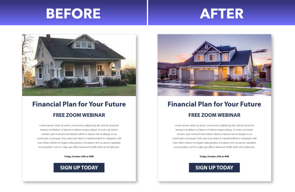
For example, look at this before and after of a simple e-newsletter. The before image has a blown out, poorly cropped, grainy image of a house. The after image has a much better photo of house. It’s crisp, vivid in colors, well-lit and generally much nicer to look at. Which ad would grab your attention first? See how using a good photo affects the overall look of a marketing piece.
Have a Call to Action
Now that you have your message and image, what is the action that you want your reader to take after having read it? Do you want them to ask for more information? To schedule a consultation? To call you? Decide what you want that action to be, and add that call to your marketing piece. Be sure to include your contact information or website so that the reader can take the action you want them to.
In the example above, the call to action is “Sign up today”. It’s even reversed out in a blue box to give it more visual emphasis. Because it’s an e-newsletter, the blue box can be clickable and link to a sign-up page. If this were a print flyer, you would need to include a link so the reader knows where to sign up.
Think about these design tips next time you are coming up with content for a marketing piece. And stay tuned for part 2 of this blog, the design tips that you can DIY on any design program.