Part 2: Design
Now that you’ve read part 1, the DIY tips on curating your content and message, it’s time for the fun part: designing it! Below are a few design tips to help you stay on track and get your message across. It doesn’t matter if you’re working in Microsoft Word, Canva or Adobe Illustrator – the guiding principles are the same no matter which tools you’re using.
Use 1-2 fonts only
We’ve all seen those awesome typography posts on Pinterest, and get inspired by them. However, it’s easy to get carried away and end up with a hodgepodge of fonts that will actually distract from your main message. If you’re new to design and typography, it’s best to keep it simple. If your brand guidelines has recommended fonts, use those. Otherwise, choose a simple style of headline, and one lighter font for the body text. You can use bold and italics (sparingly) to highlight key points.
Keep in mind the end goal of the piece, which is for your customers to read it! Choose fonts that are easy to read over fonts that “look nice”. Definitely avoid using a lot of fancy script fonts, especially in the body text. If handwritten or script fonts are a big part of your brand, you can use them in large headlines or as highlight text, but don’t use them in the main body text.
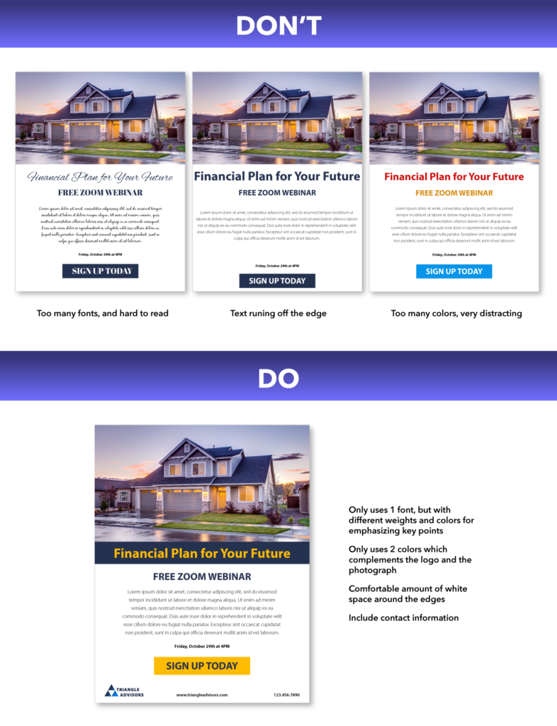
Mind your margins
You know how a new Word document comes with set margins? There’s a reason for that – content that’s too close to the edge appears to be “falling off”, and leads the viewer’s eye away from the center of your design. Also, when your piece is being printed, there’s a risk something on the edge will get cut off. Either way, leave some space around the edge. For something small like a business card, a 1/8″ margin is the standard. If you’re doing something like a brochure or flyer, you should leave a 1/4″ margin so it doesn’t look like the content is running off the edge.
Leave some white space
Speaking of space, white space is your friend! These are the blank areas in a design that don’t contain text or images, and these spaces allow the viewer’s eye to “rest”. Without white space, you’d have solid block of text that’s very off-putting to your audience (when did you last read an ad that was a solid text wall?). Use titles, images and bullet points to break up text and make it easy to understand.
Colors
Picking colors for your design can be a lot of fun… or stressful if you don’t have an eye for it (or maybe a color theory class). If you don’t have brand color guidelines to help you, stick with the primary colors in your logo and use them in your headlines or as accent colors. Leave the body text black or neutral. If your logo is black and white, or you don’t really have one, you can use colors based on your primary image. For example, the blues and yellows from our sample flyer are drawn from the photograph of the house.
Pro tip: there’s no magic color that will increase conversions, but if you want something to stand out, use a contrasting color! For example, if your logo is blue and gray, and your main image is also neutral toned, red or orange would really pop out and draw attention to your call to action.
Test print!
Be sure to print out your design at 100% to check that the text is easy to read and a good size, your margins are correct, and your colors are looking good. Your home printer won’t necessarily produce the same colors as your final print order, but it will give you an idea of potential problems. If you’re designing your own trifold brochure, try folding it up to make sure your panels are in the correct order.
Thanks for tuning in! Hopefully these tips will help you next time you have to whip up a DIY marketing piece for your business. Feel free to contact me! I would love to see what you came up with, or answer any questions you have.